A prominent construction service company in southeastern TN wanted to expand its sub-brand portfolio.
The first sub-branded company they launched was RoofingCo.com, a roofing company. The identity we developed for this company was instrumental in shaping our approach to branding ConcreteCo.com.
The Problem
With RoofingCo.com being the first of many brands to be created, we knew we had to develop an identity that fit seamlessly with the previously established identity. The ownership team wanted a cohesive portfolio of sub-brands that fit together when appearing side-by-side.
The Solution
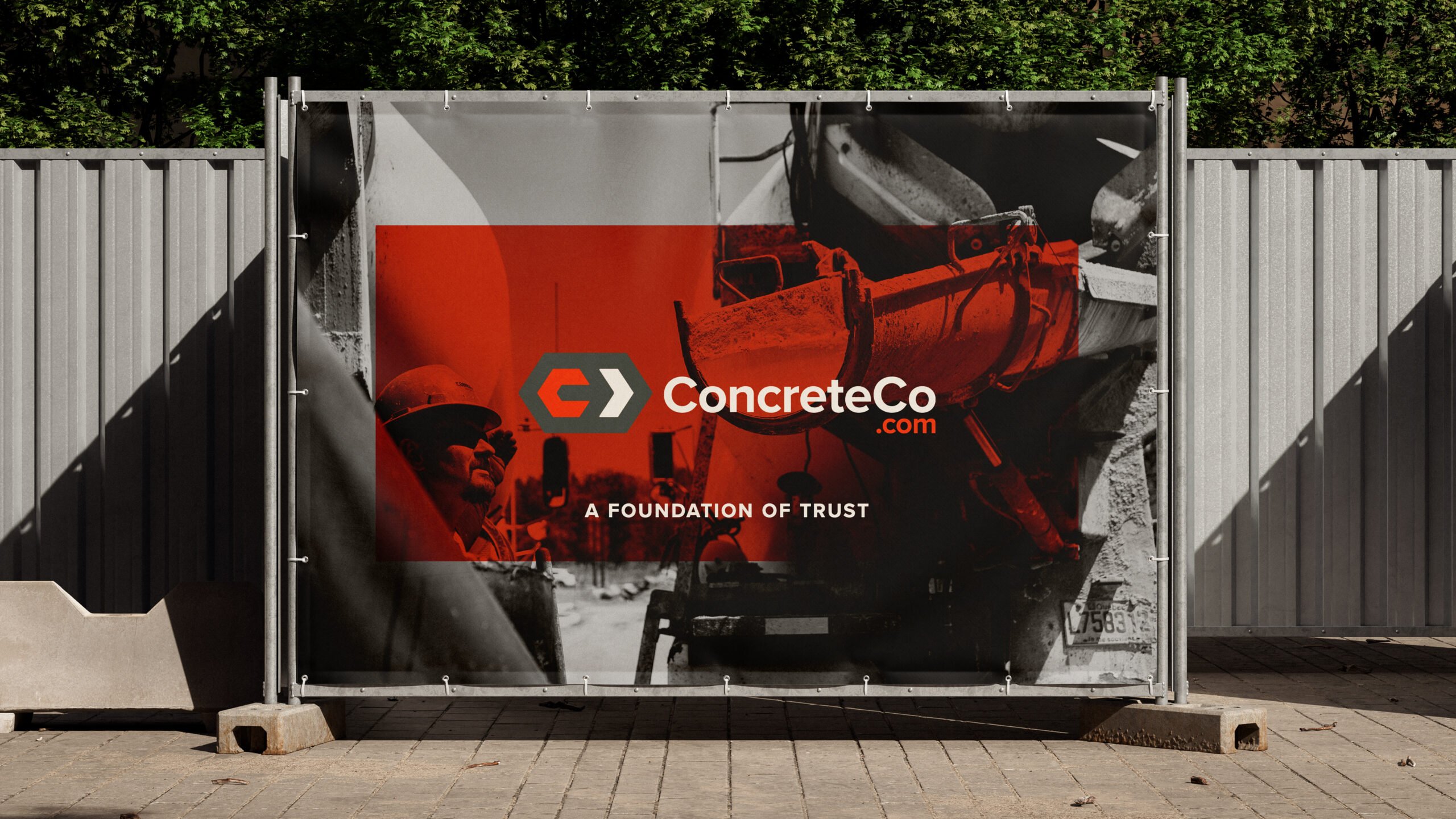
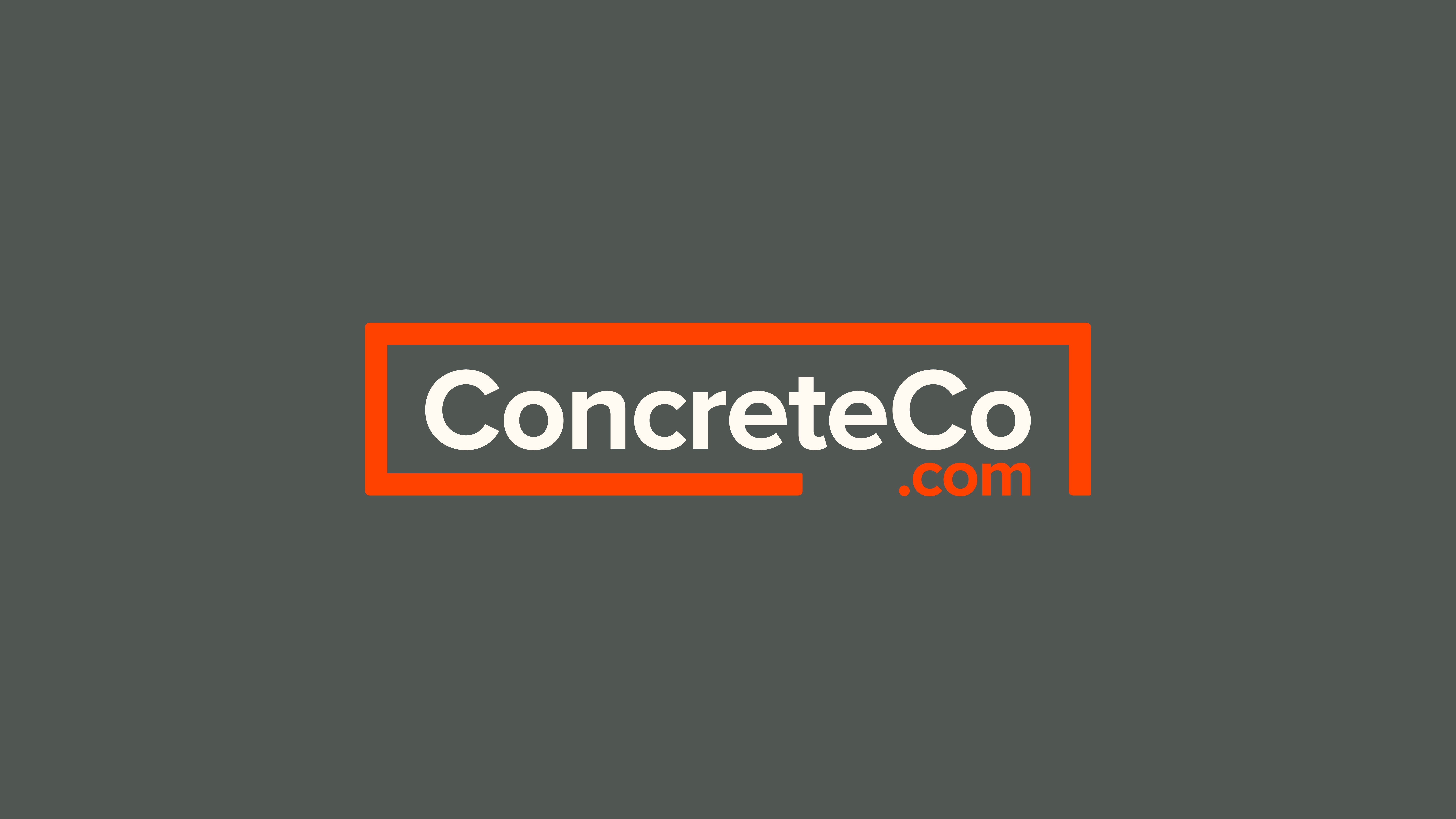
We created fifteen initial identity options, which were presented to ConcreteCo.com’s ownership group. After selecting three for full development, we landed on a logo that matched the previously established brand ecosystem of RoofingCo.com.
Logo Design
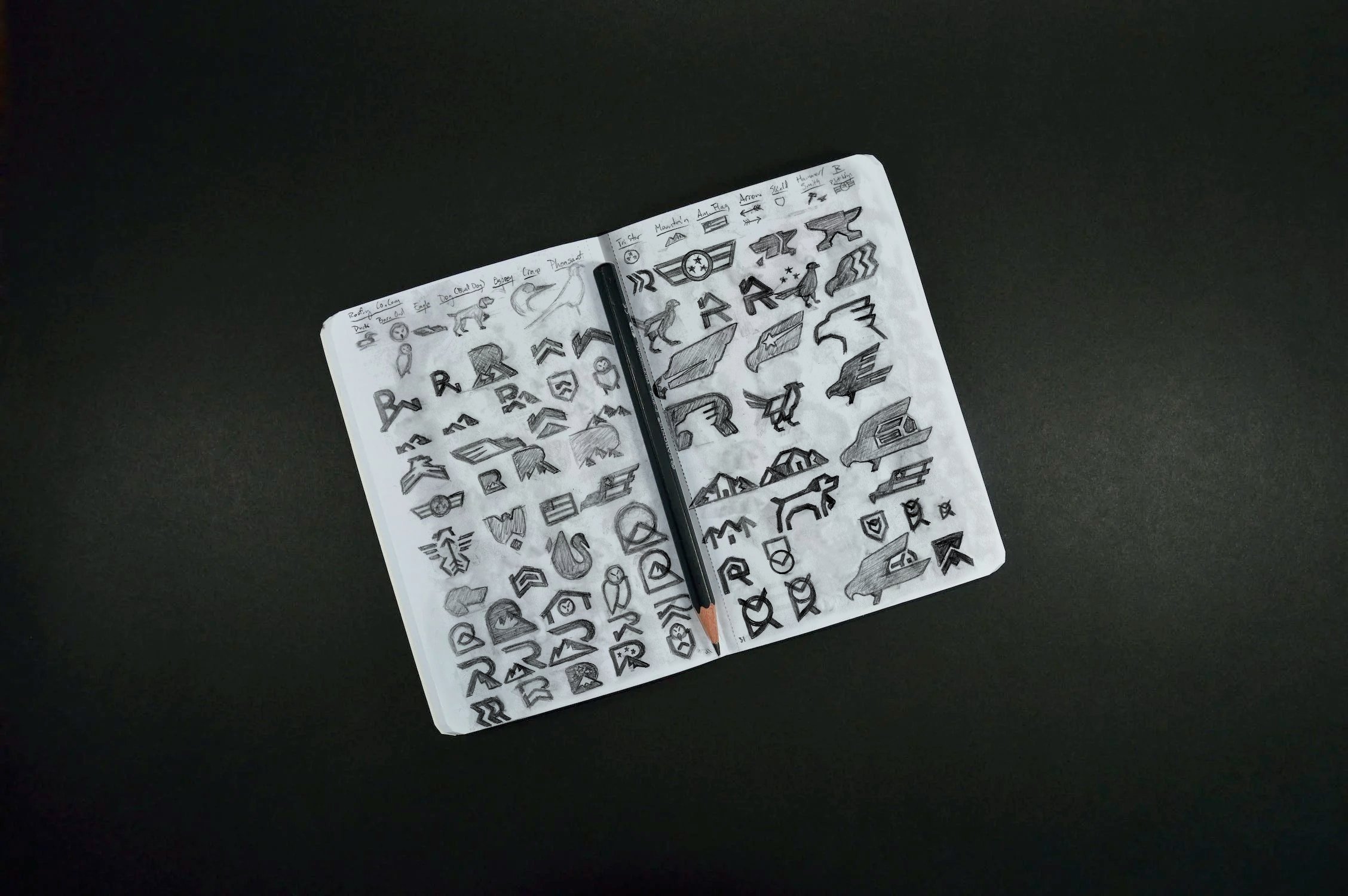
When we sat down with ConcreteCo.com’s ownership group, we walked them through our “brand noun” exercise to discover their core values. We analyze a company’s core values and identify ways to embody them through a unique logo design. The list of ConcreteCo.com’s brand nouns included:
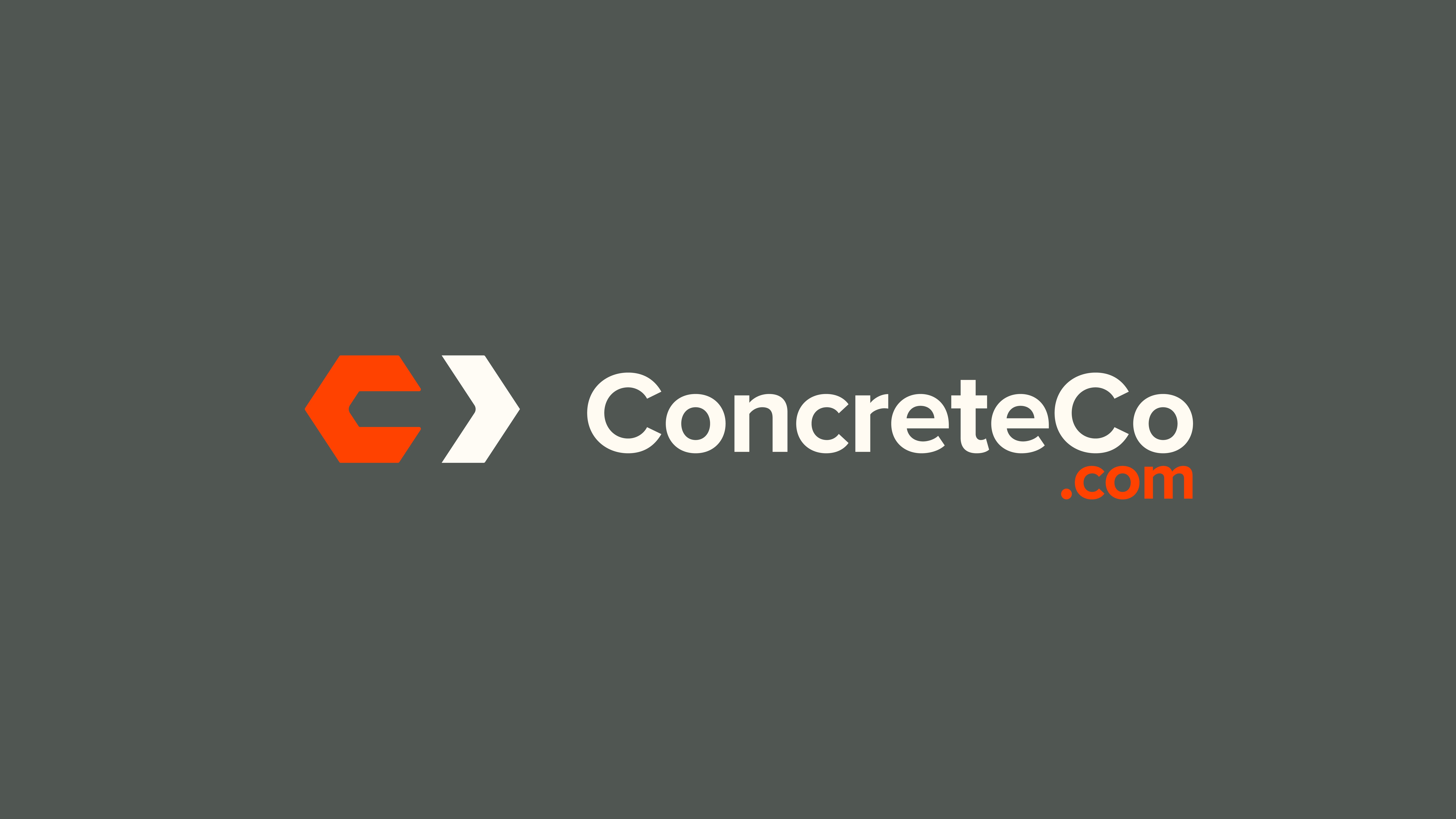
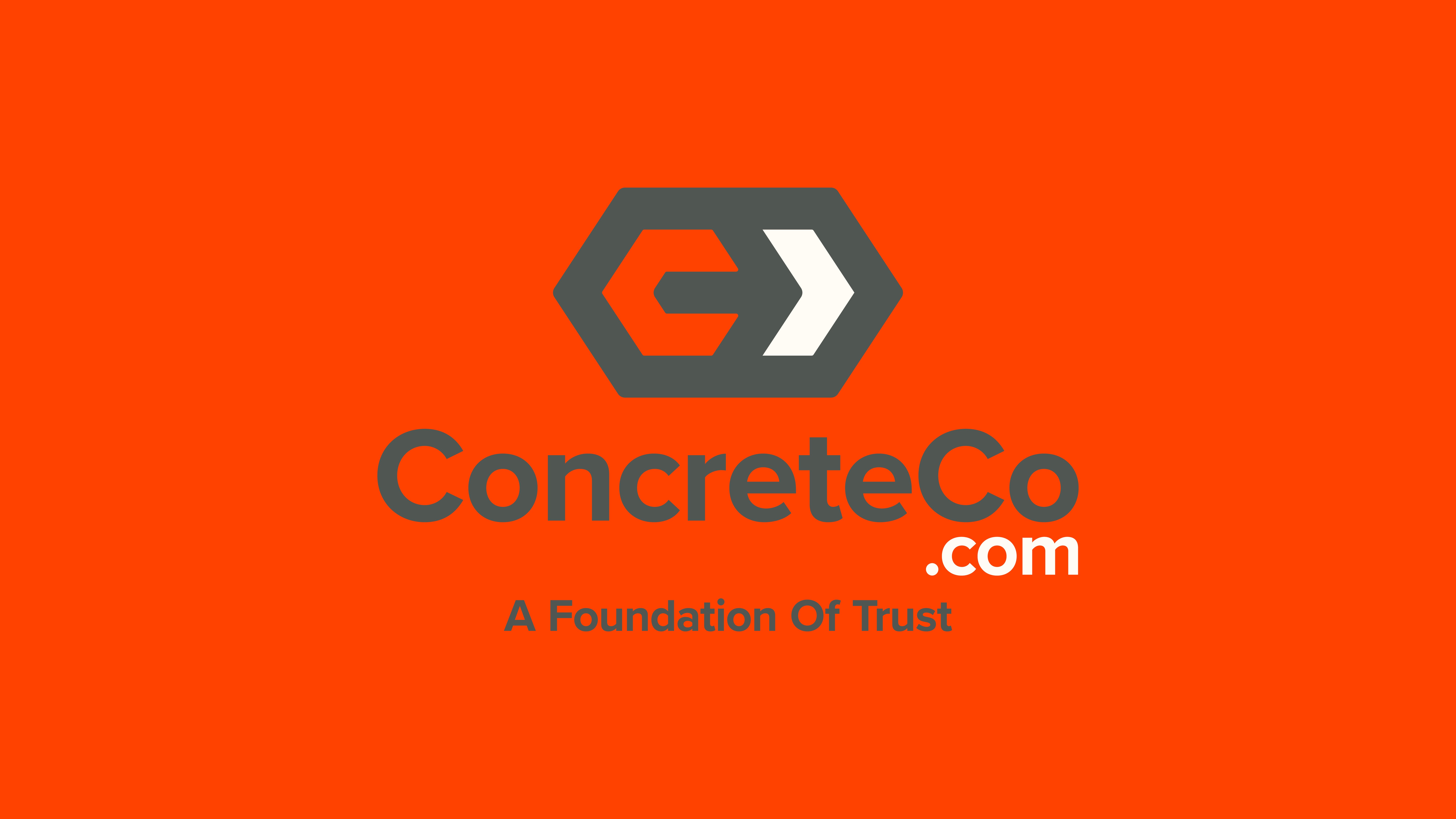
Letter C represents the company name
Arrows to symbolize growth
A visual similarity to the previously designed RoofingCo.com logo
Initial Sketches
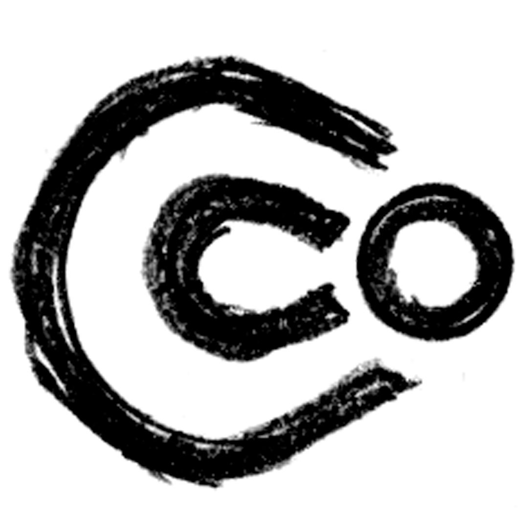
C + Co
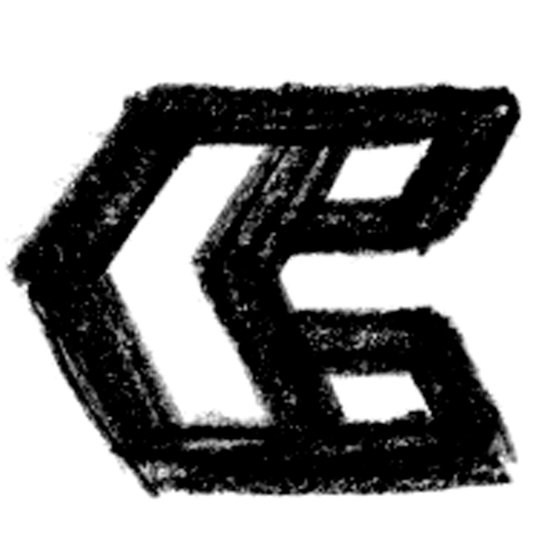
C + Arrow
C + Arrow
C + Arrow
The results
Highly Recommend
Best graphic design work you could possibly hope for. Excellent partnership, communication, and finished product.